Everyday Objects
Photography & Print Design


A commissioned set of 20 photographic prints — championing commonly found consumer products.
The featured objects were sourced exclusively from supermarket shelves or similarly accessible shops, selected by a group of individuals who also provided written critiques of their chosen items. The project aimed to catalogue and showcase these objects alongside their critiques in a gallery display at the University of East London’s School of Arts & Creative Industries. This exhibition was part of UEL Detour Ahead, a week-long event featuring guest speakers and industry practitioners sharing insights into their career paths and experiences.
Designed to create a visually cohesive presentation, the project sought elements that would differentiate the objects while maintaining a unified theme.
Using colour as the central theme, each print aimed to highlight the object’s most visually communicative hue, exploring colour’s role in branding, consumer appeal, and the emotional responses it can evoke. This led to a photographic approach in which each object was consistently framed centre stage, placed against a backdrop colour referenced directly from its own packaging.


Inspired by how products are displayed on shop racks, the layout and production were designed to maintain a structured and consistent format across all, while displaying each object at its actual life size on print.

A blank section at the top was incorporated to accommodate an eyelet hole for hanging, referencing how some products are displayed in retail environments.

To emphasise specific graphical elements in their packaging designs, some items were photographed against dual backgrounds. Inspired by swatch colour books, this approach influenced the tall 1:2 image ratio, creating two stacked coloured squares on top of eachother. This was also designed to introduced a dynamic rhythm to the overall presentation, breaking the repetition of single-coloured backgrounds.

The text was positioned at the bottom to ensure an uninterrupted, photography-led viewing experience, encouraging the viewer to engage with the object first before moving on to its contextual narrative.


Komorebi Magazine
Editorial Design of an Art & Culture Magazine

Thirdway Boutique
Editorial Design for an Interior Design Company

Megazine
Identity & Editorial Design of an Art‑Feature Publication

Type & Riso
Poster Design for a Creative Workshop

Miamani Fortura
Identity & Editorial Design for an Independent Artist

Clutch
Branded Assets Design for a Restaurant & Bar in East London

Easy Cookbooks
Editorial Design of a Cookbook Series
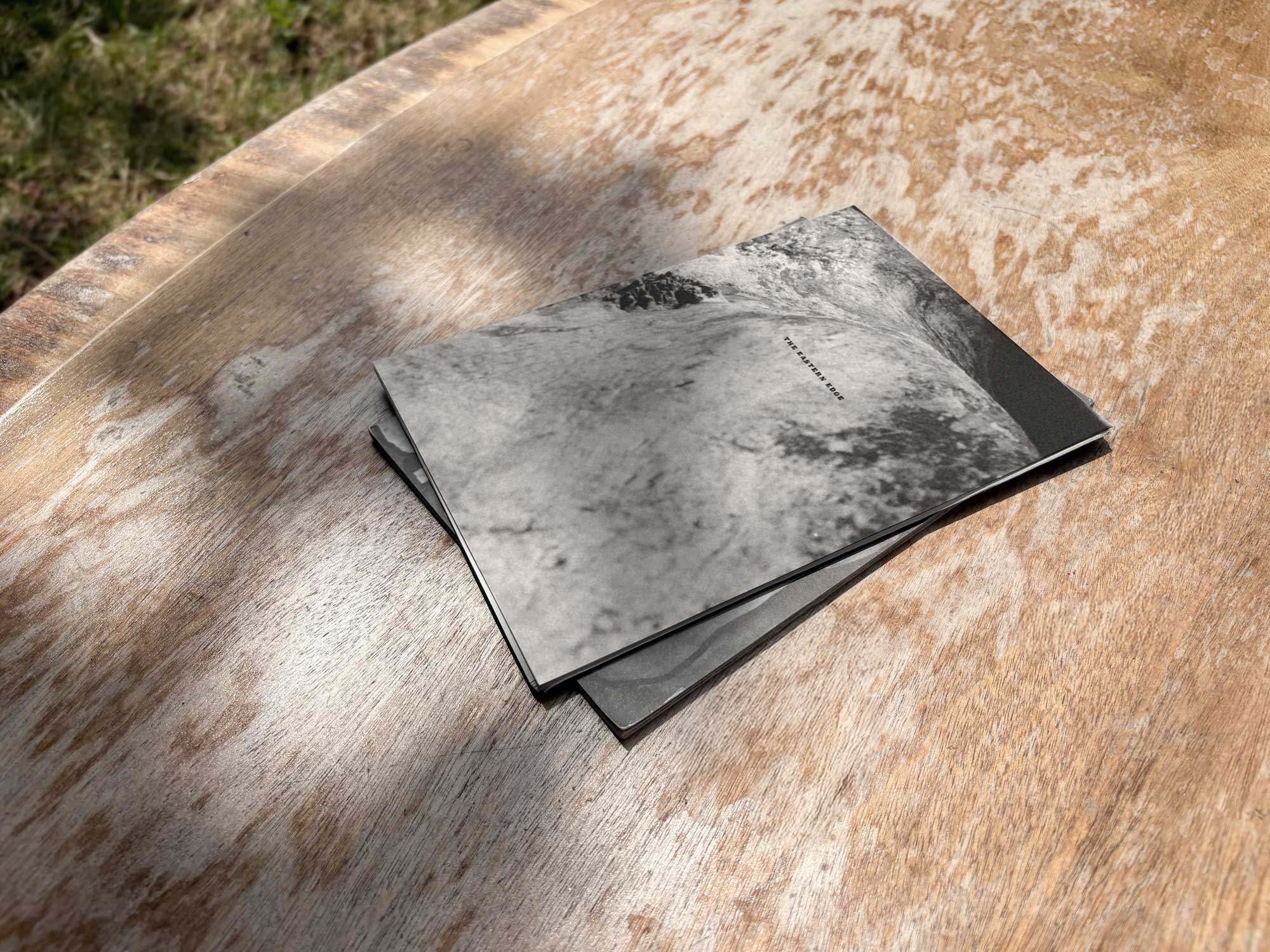
The Eastern Edge
Editorial Design of a Publication about East London
Everyday Objects
Exhibit Artwork Design & Production

Single Hand Clock
Product & Packaging Design of a Minimalistic Timepiece

G20-16
Identity & Cover Design of a Student‑Lead Publication
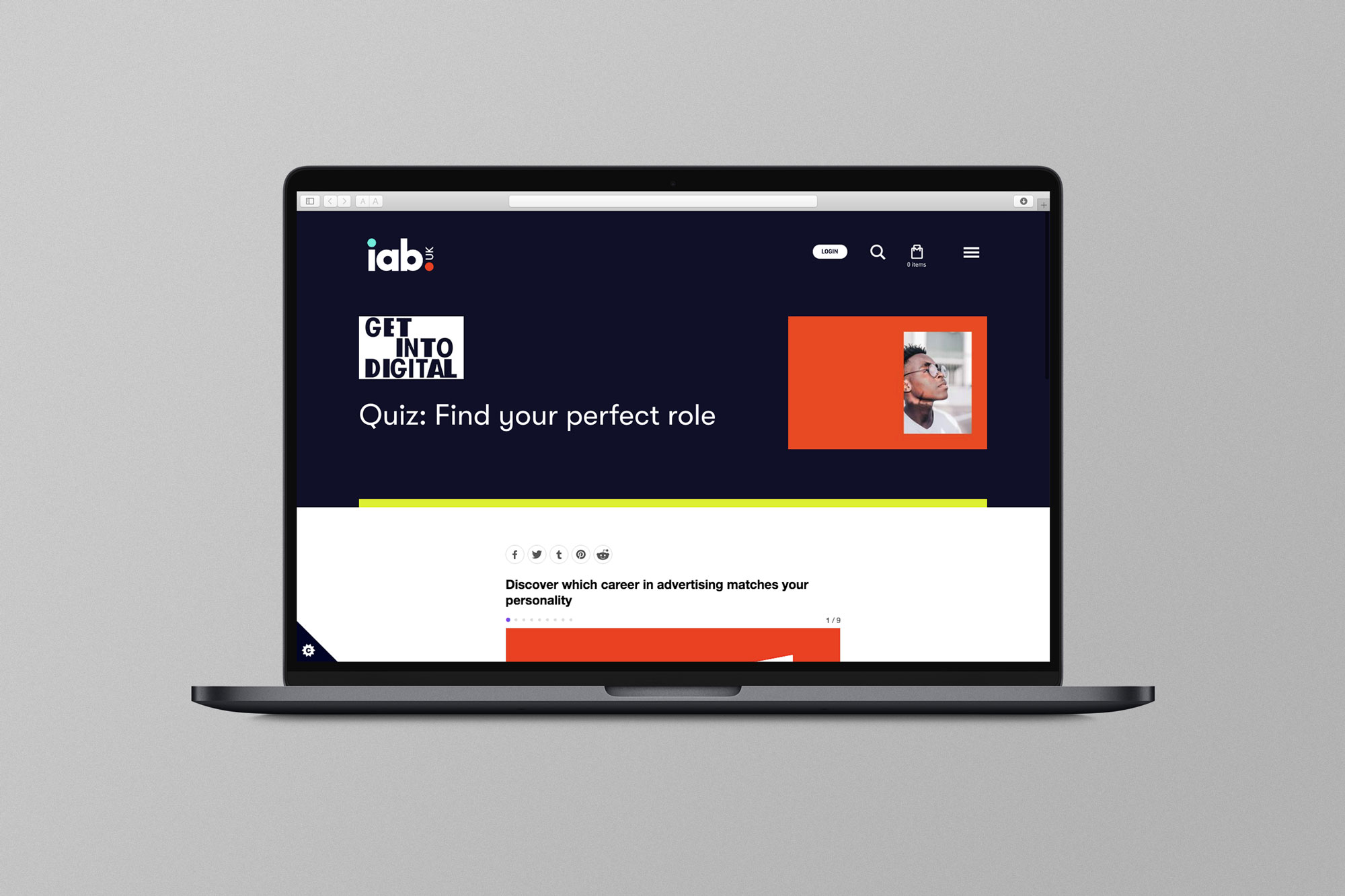
EX.CO & IAB
Interactive Article promoting roles into Digital to students

Valerio
Identity Design for an Independent Gardener

Donati Metalli
Logo/Identity Design for an Italian Metallurgical Company

EX.CO & Boots
Interactive Digital Article promoting Boots Vitamins for Kids

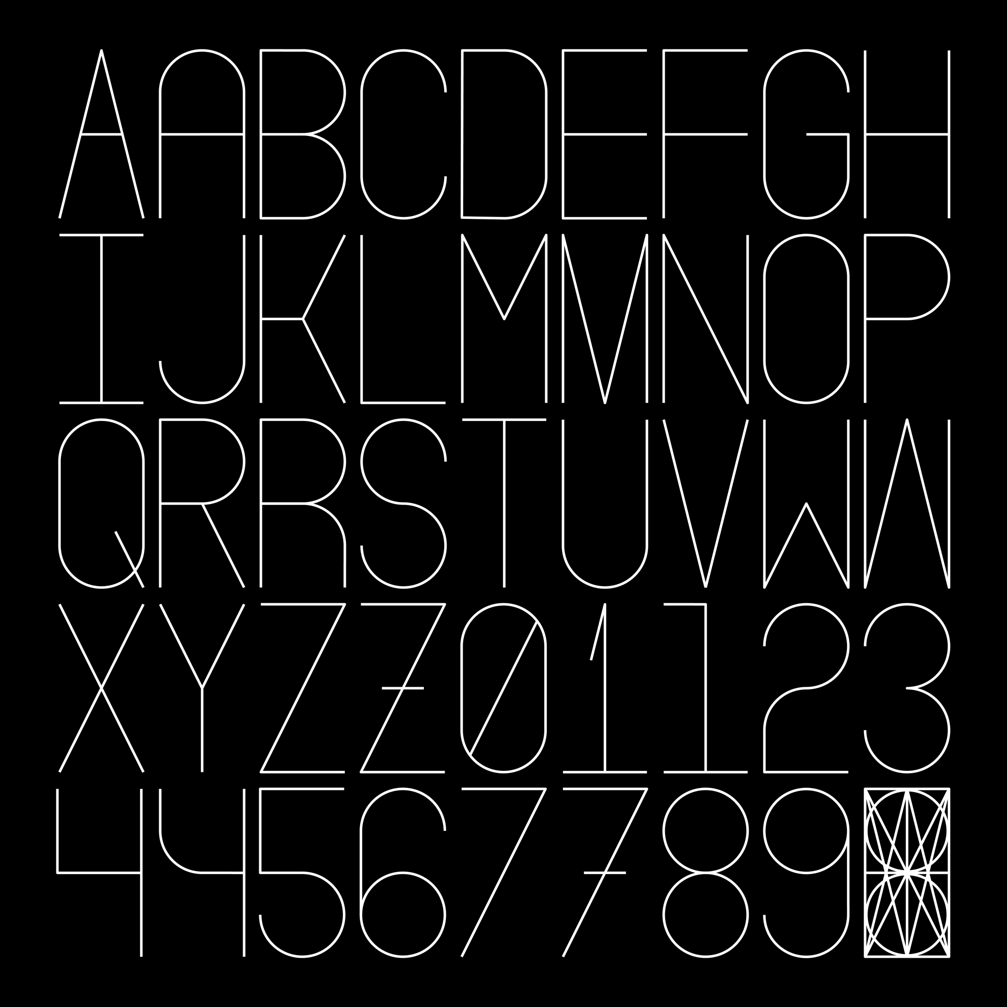
Undone Type
A Geometric Alphabet Design
Houdini Alphabet
An Alphabet Designed from a Grid-Like Figure