Komorebi Magazine
Editorial Design
An art and culture publication encompassing a variety of authors and contributors — designed to reflect the individuality of each piece through layouts, typography, compositions, and visual treatments, created to compliment the articles’ content, their subject matter, and imagery.

Intro / The Brief
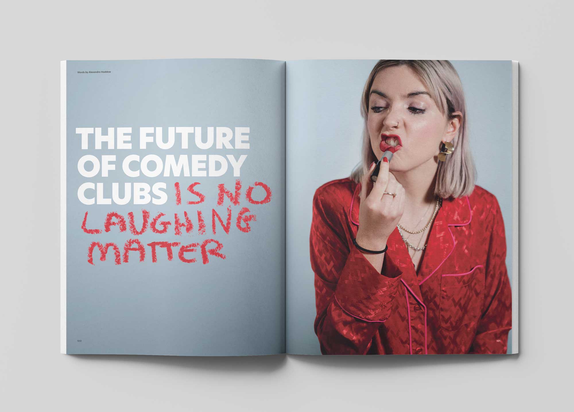
Komorebi Magazine is an independent publication named after the Japanese term for sunlight filtering through trees. It focuses on creativity, storytelling, and culture, covering subjects such as art, design, music, cultural movements, and social commentary.
The objective was to create an art and culture journal in which each article reflected its story. Through flexible, content-led layouts that balanced cohesion with individuality, the aim of supporting the pieces’ narratives and visual storytelling focused the design on producing a visually eclectic publication with minimal, yet bold interventions, with an emphasis on immersive, content-driven experiences.


My Role
Collaborating with Komorebi’s founder during the magazine’s planning stages, reflecting his vision and developing the editorial design across the entire publication.
As the sole designer working on this, my responsibilities included incorporating the provided content, such as photography, illustrations and text, creating structured layouts, integrating typography and visual treatments to enhance the magazine’s features storytelling experience.


Concept / Strategy
The term ‘Komorebi’ refers to the Japanese expression for sunlight filtering through trees, creating unique strands of light every time they appear. Drawing inspiration from this concept, the design focused on balancing individuality and cohesion through:
Creating a cohesively eclectic visual language through structured yet flexible layouts, typography, and visual treatments that reflects the magazine’s stories and exressions.
Approach
Reflective Layouts: Each article was designed to reflect its unique story, employing varying typographic and visual treatments to create an immersive and dynamic reader experience.
Structured Flexibility: Developed a flexible layout system that integrates structured grids with expressive design elements, allowing each piece to maintain its distinct identity while contributing to the magazine’s overall aesthetic.
Visual Storytelling: Integrated photography, illustrations, and typography to enhance the narrative, ensuring that the components effectively complemented the written and visual content.


With multiple contributors and varied content styles, the challenge was to balance consistency with the individuality of each article, creating visual narratives with ideas derived from the articles’ visuals and written content.
Through the development of a flexible layout system that integrates structured grids with expressive design, each piece was designed to maintain its distinct identity while contributing to the magazine’s overall aesthetic.


Featuring essays, interviews, and original stories, Komorebi Magazine presents a diverse range of voices and disciplines, aiming to speak to an audience drawn to visual culture, in‑depth storytelling, and creative discourses, as well as those interested in contemporary culture and curious about independent publishing.
The inaugural issue of Komorebi Magazine was well‑received, successfully engaging readers with its diverse content and design.


Komorebi Magazine
Editorial Design of an Art & Culture Magazine

Thirdway Boutique
Editorial Design for an Interior Design Company

Megazine
Identity & Editorial Design of an Art‑Feature Publication

Type & Riso
Poster Design for a Creative Workshop

Miamani Fortura
Identity & Editorial Design for an Independent Artist

Clutch
Branded Assets Design for a Restaurant & Bar in East London

Easy Cookbooks
Editorial Design of a Cookbook Series
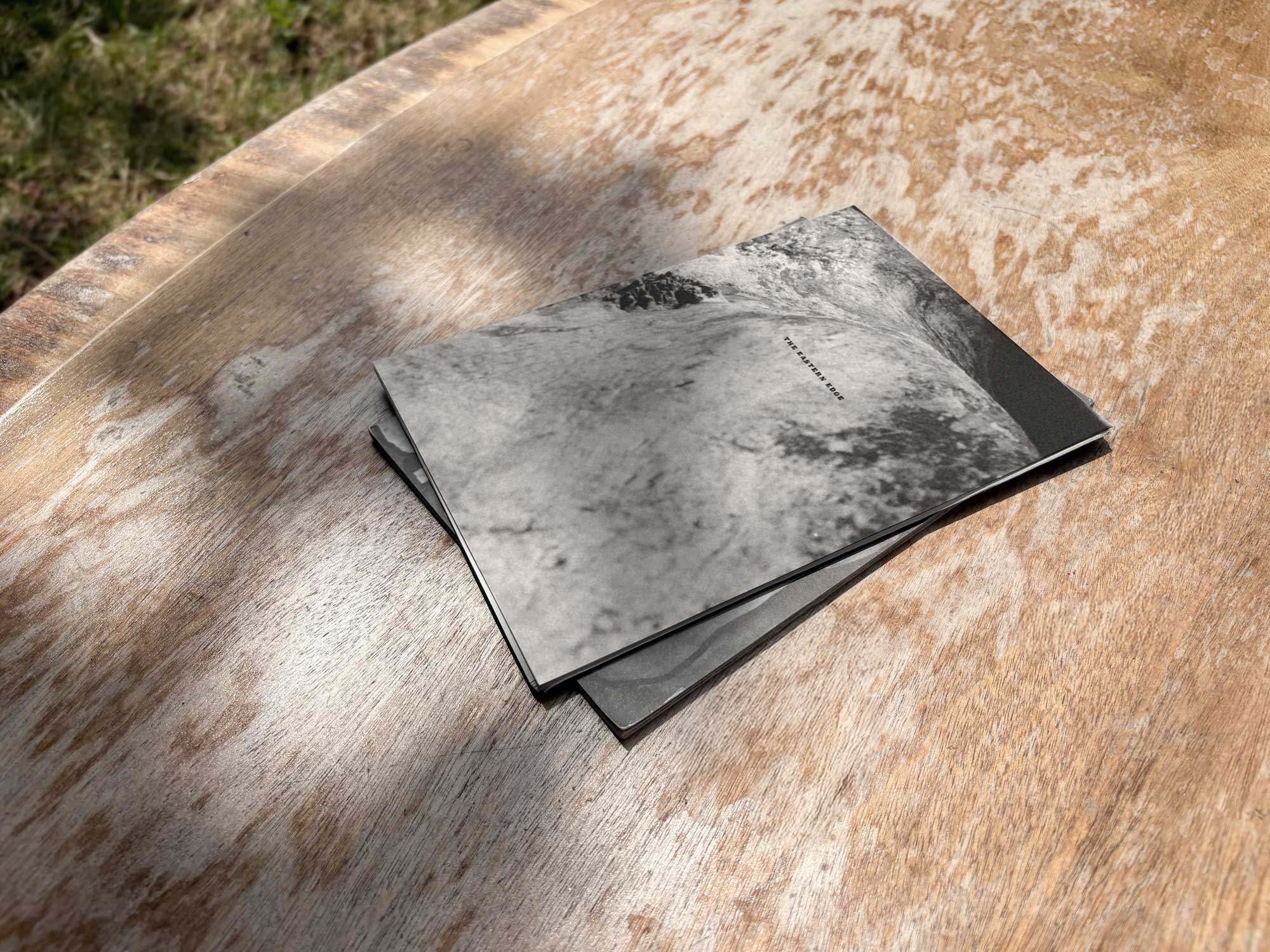
The Eastern Edge
Editorial Design of a Publication about East London

Everyday Objects
Exhibit Artwork Design & Production

Single Hand Clock
Product & Packaging Design of a Minimalistic Timepiece

G20-16
Identity & Cover Design of a Student‑Lead Publication
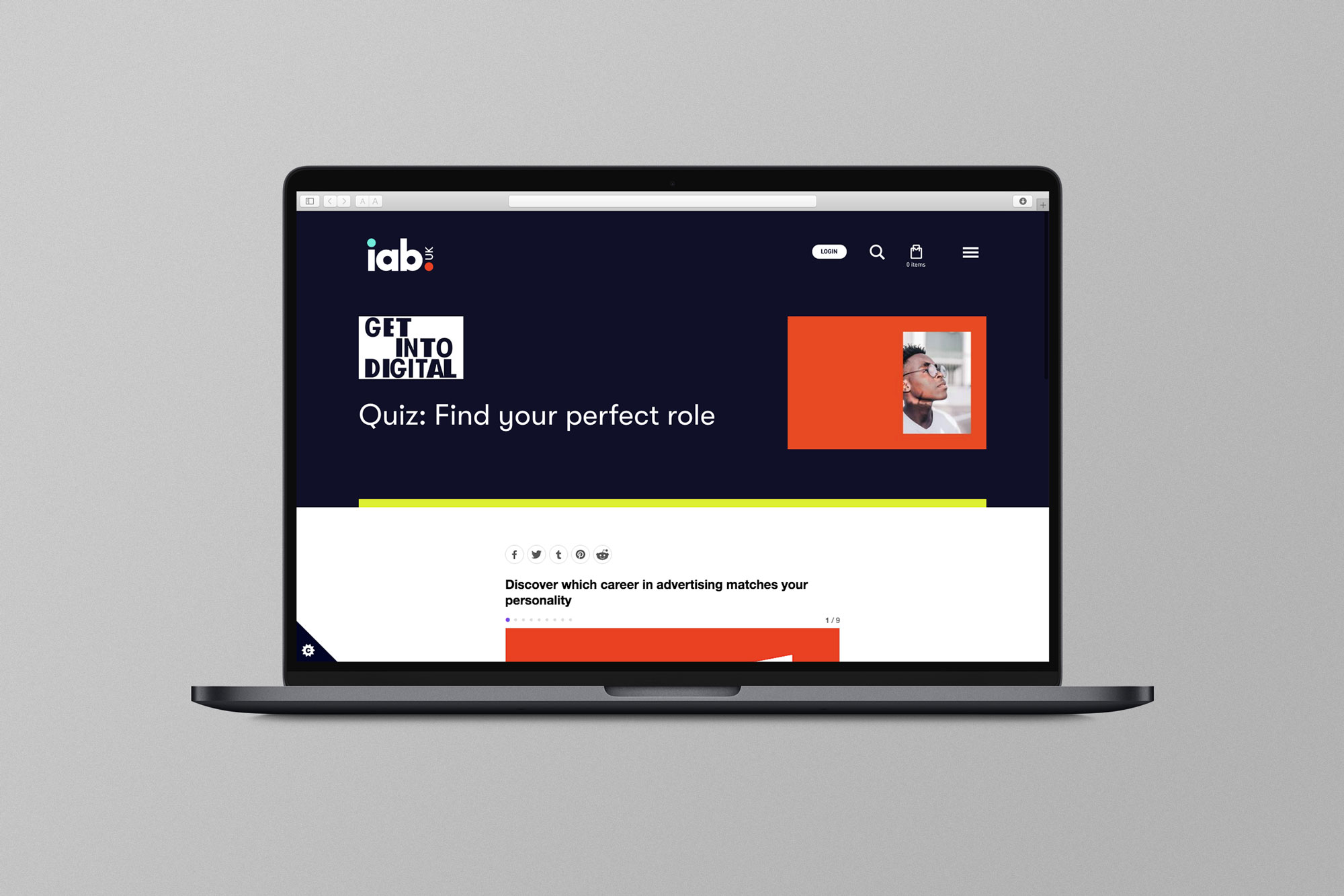
EX.CO & IAB
Interactive Article promoting roles into Digital to students

Valerio
Identity Design for an Independent Gardener

Donati Metalli
Logo/Identity Design for an Italian Metallurgical Company

EX.CO & Boots
Interactive Digital Article promoting Boots Vitamins for Kids

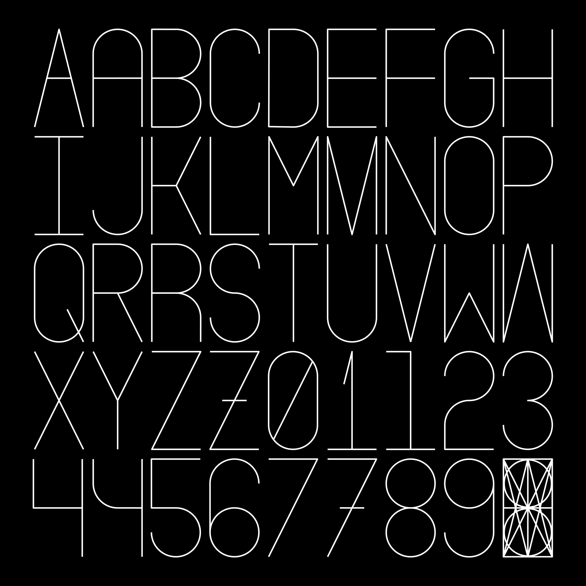
Undone Type
Alphabet Design
Houdini Alphabet
Alphabet Design