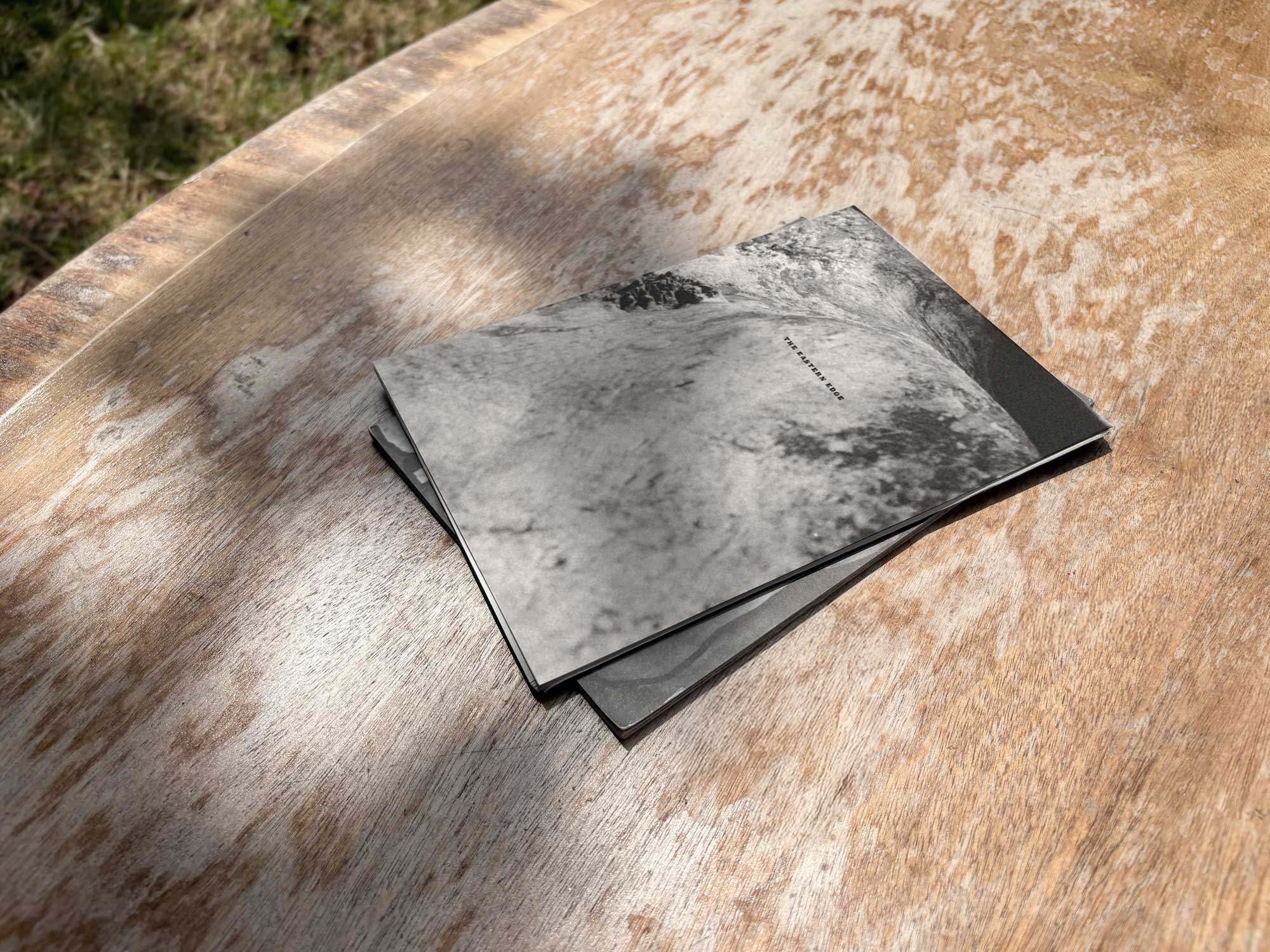
The Eastern Edge
Editorial Design
A publication presenting East London’s suburban spaces through observational photography and narrative, designed with minimal interventions to complement and support the project’s reflective nature.


Intro / the Brief
The Eastern Edge is an essay that observes East London’s lesser‑frequented environments — its suburbs, overlooked corners, and quiet in‑between spaces. Framed as a response to the question “Why do we take pictures?”, the project reflects on East London’s evolving character — from what it was, to what it became, to what it might become — and how photographs can preserve, call back to, and hold onto moments that might otherwise be lost, capturing the integrity and atmosphere of spaces before they begin to shift.
The aim was to remain understated — allowing the content to unfold through a rhythm that echoes the project’s themes of stillness, observation, and subtle documentation.


My Role
Leading the editorial design of the publication — translating the rhythm and visual logic of the pieces into a physical format.
My role involved developing a clear layout system and typographic tone that would support, rather than compete with the content. From cover design to grid structure and typographic treatment, the aim was to allow the reader to inhabit the content’s quiet atmosphere, guided by subtle interventions of type, imagery, and pacing.

Concept / Strategy
Rooted in restraint — rejecting ornamentation in favour of a minimal, utilitarian approach that would foreground the photographs and reflect the spirit of East London’s overlooked urban landscapes.
Creating a rhythm of space, silence, and pause — supporting the narrative through structure, not decoration.
Approach
Typographic Neutrality: Employing a reduced typographic system with modest sizing, generous spacing, and unembellished alignment to match the project’s neutral and reflective tone.
Pacing and Layout: Balancing dense sections with quiet moments of imagery or text — allowing the content to guide the reader through the piece with a contemplative rhythm.
Imagery Integrity: Evoking an authentic, raw, and unaltered quality through the retention of film edges within photographic reproductions — reinforcing the project’s observational nature and unresolved subject matter, while rejecting visual sanitisation in favour of an intentionally unaltered aesthetic.
Materiality: Selecting uncoated stock with a soft grain texture to complement the imagery and mirror the urban nature of the subject matter — emphasising honesty and visual quietness.


As a companion to the essay it presents, the design aims neither to announce nor to editorialise — instead focusing on creating subtle contemplative moments and allowing silent observations to take the lead.
The publication opens with an abstract cover, offering a subdued introduction to the tone within. Inside, spreads alternate between expansive imagery and framed compositions, interspersed with passages of unadorned text that encourage slow, uninterrupted reading. Designed for those drawn to quiet narratives and urban peripheral landscapes, the piece’s design reinforces its subject matter through restraint — acting as a silent frame for observation rather than a statement of design. Nothing seeks attention; instead, the publication disappears into the background by design, allowing the story to quietly emerge on its own terms.

Komorebi Magazine
Editorial Design of an Art & Culture Magazine

Thirdway Boutique
Editorial Design for an Interior Design Company

Megazine
Identity & Editorial Design of an Art‑Feature Publication

Type & Riso
Poster Design for a Creative Workshop

Miamani Fortura
Identity & Editorial Design for an Independent Artist

Clutch
Branded Assets Design for a Restaurant & Bar in East London

Easy Cookbooks
Editorial Design of a Cookbook Series
The Eastern Edge
Editorial Design of a Publication about East London

Everyday Objects
Exhibit Artwork Design & Production

Single Hand Clock
Product & Packaging Design of a Minimalistic Timepiece

G20-16
Identity & Cover Design of a Student‑Lead Publication
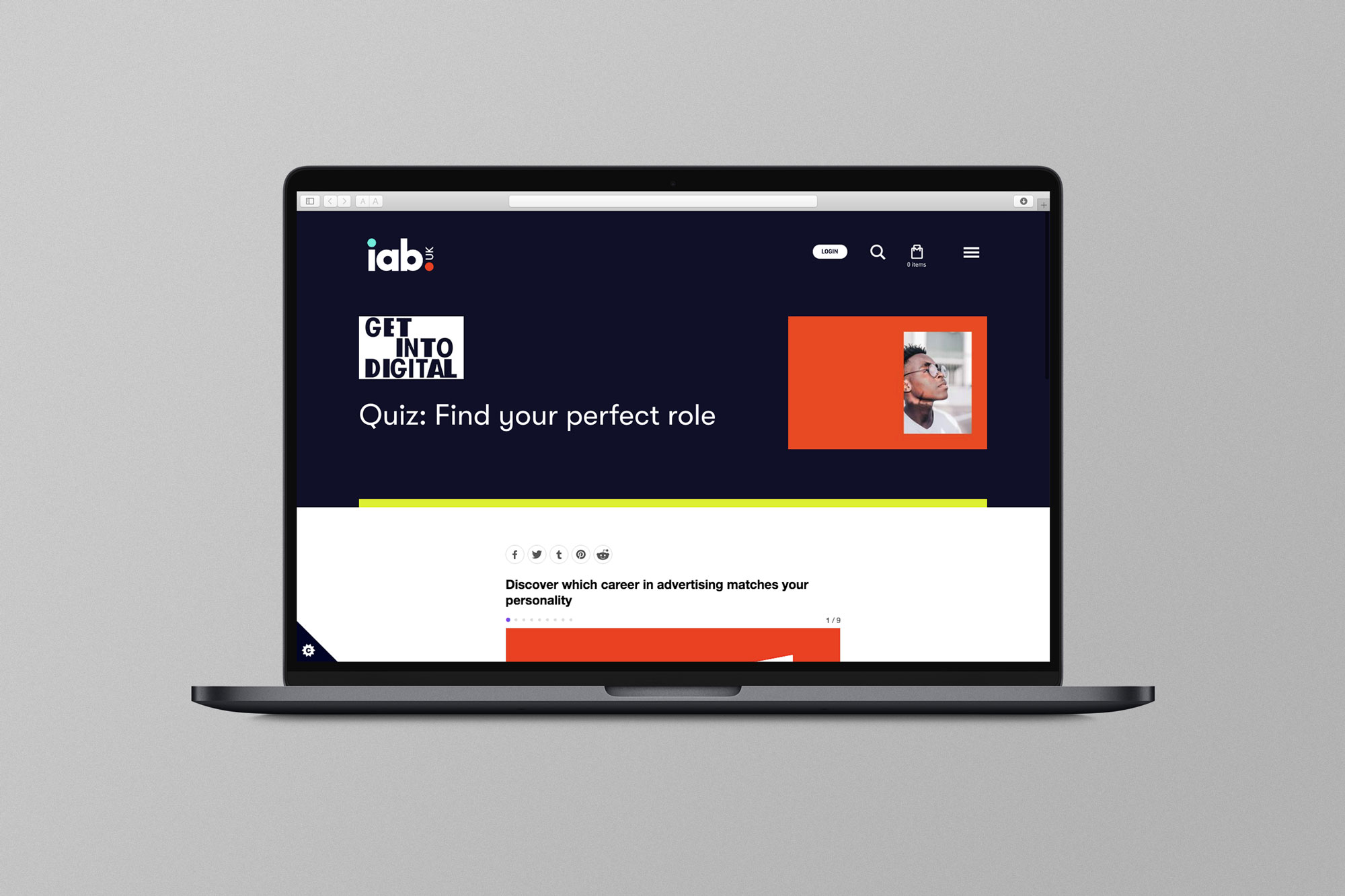
EX.CO & IAB
Interactive Article promoting roles into Digital to students

Valerio
Identity Design for an Independent Gardener

Donati Metalli
Logo/Identity Design for an Italian Metallurgical Company

Undone Type
A Geometric Alphabet Design

EX.CO & Boots
Interactive Digital Article promoting Boots Vitamins for Kids