Thirdway Boutique
Editorial Design
A credentials booklet for an interior design team, designed to create a refined tactile experience that reinforces trust, confidence, and craftsmanship.

Intro / the brief
Thirdway Boutique is a specialist team of Thirdway Interiors, offering bespoke interior design solutions for premium clients. With a client meeting coming up, the Boutique’s team sought to create a credentials booklet with the goal of establishing trust and confidence — introducing the company, showcasing case studies, and effectively communicate Thirdway Boutique’s approach to interior design.
The booklet objective was to communicate the company’s values with its Boutique’s team design philosophy, serving as a tactile and refined leave‑behind that inspired trust and confidence from the very first in‑person client interaction.


My role
Collaborating with Thirdway Boutique’s Managing Director during the booklet’s planning stages, translating her vision for the project, developing the design across the entire piece.
As the sole designer working on this, I was responsible for the editorial design and production of the credentials booklet, leasing with printers and suppliers, and ensuring that the visual presentation aligned with the company’s values, while effectively communicating Thirdway Boutique’s approach to interior design. Working with the provided content, including text and a large library of beautifully photographed interior spaces, I oversaw every aspect of the booklet’s design — from material selection to typographic systems and layout design — with the goal of creating a publication that not only presented information clearly, but that embodied the same attention to detail and refinement that defines Thirdway Boutique’s interior work.


Concept / Strategy
The design centred around creating a cohesive visual language that aligned with both Thirdway and the concept of a Boutique client ethos, blending Thirdway’s branding with a new Boutique experience — translating abstract concepts into concrete visualisations that conveyed high quality and professionalism — balancing clarity and sophistication through considered content, thoughtful layout, and premium materiality for an informative, refined, and tactile experience.
Conveying core messages and the physicality of elegance — translating a high‑end interior experiences into a printed format.
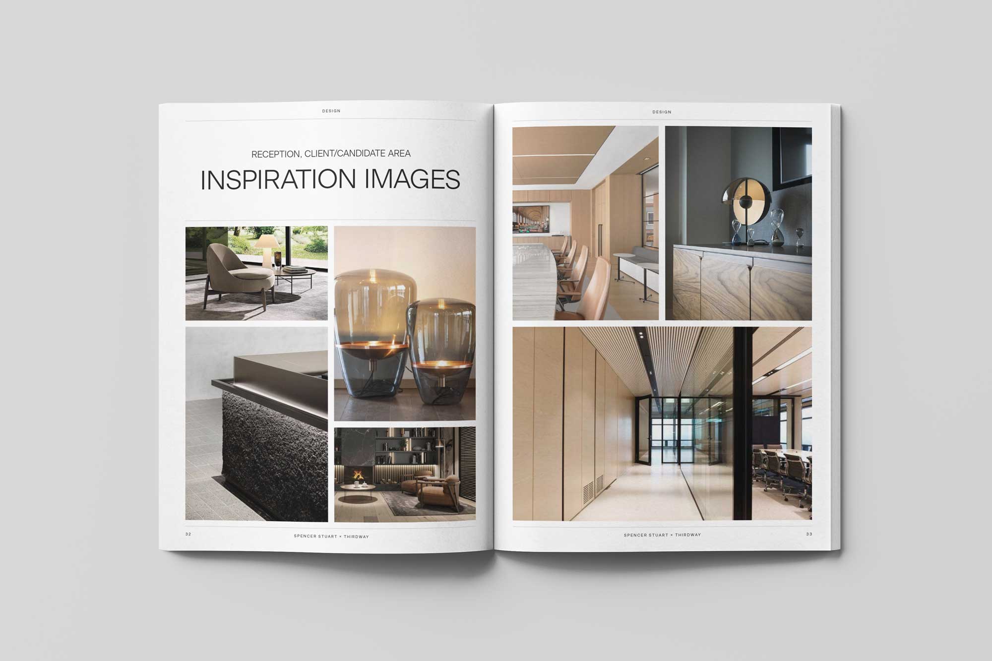
Content Curation: Selecting work examples and imagery from Thirdway’s case studies library and broader projects archive that aligned with the prospective client — collaborating with the team’s Managing Director to create tailored narratives that added clarity and strategic relevance.
Material Selection: Choosing materials that communicated elegance and sophistication, considering the client’s ethos and reflecting the Boutique team’s brand narrative, with a nod to luxury product’s packaging as well as refined interior spaces — featuring a deep blue, leather textured cover with silver foiling, complimented by extra bright, soft‑touch, silky white paper for the inner pages.
Layout and Typography: Developing a grid system and refining Thirdway’s typographic palette, maintaining visual structure while allowing the content to breathe and convey its messaging — incorporating space, rhythm, type, and imagery pacing to support clarity and flow.
*Mid‑development, a shift in visual narrative was introduced to break the pattern of photography-led pages, and to add a new layer of interest while reinforcing a sense of artistry and craftsmanship.
Visual Rhythm Intervention: A nature-inspired artistic approach was implemented for the ESG (Environment, Social, Governance) section, featuring artworks’ images contributed by an Artis close friend of the company, who is also an advocate for Thirdway’s ESG practices. This approach was designed to visually embody Thirdway’s commitment to social responsibility, sustainability, and the lasting impact of considered, human‑centred, ethical design choices.


The booklet became an effective tool for early‑stage client interactions — establishing a trustworthy and tactile impression that stood apart in a competitive industry.
Reinforcing Thirdway Boutique’s positioning as a forward-thinking, refined interior design team, the booklet featured interior design strategies, case studies, sustainability practices, and value‑driven messaging. It underscored the company’s focus on client collaboration, innovation, creativity, and sustainable thinking — building trust early in the process, resulting in productive clients relationships.

Laying the foundation for the new Thirdway Boutique’s clients communications.
The new visual language was also adopted across the team’s wider suite of documents — where layout structures, typographic treatments, and grid systems were expanded and also adapted across widescreen digital formats. This led the creation of new bid submissions, presentations, project proposals, and credentials documents that delivered technical and conceptual information with clarity, while maintaining a consistent look across the Boutique’s team visual assets — establishing trust and confidence from early introductions to project’s proposals, through to pitches and presentations that finalised clients collaborations.


Komorebi Magazine
Editorial Design of an Art & Culture Magazine
Thirdway Boutique
Editorial Design for an Interior Design Company

Megazine
Identity & Editorial Design of an Art‑Feature Publication

Type & Riso
Poster Design for a Creative Workshop

Miamani Fortura
Identity & Editorial Design for an Independent Artist

Clutch
Branded Assets Design for a Restaurant & Bar in East London

Easy Cookbooks
Editorial Design of a Cookbook Series
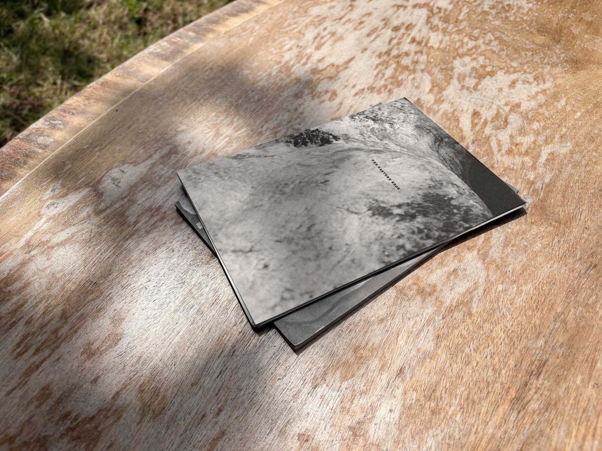
The Eastern Edge
Editorial Design of a Publication about East London

Everyday Objects
Design & Production of an Exhibit of Ordinary Products

Single Hand Clock
Product & Packaging Design of a Minimalistic Timepiece

G20-16
Identity & Cover Design of a Student‑Lead Publication
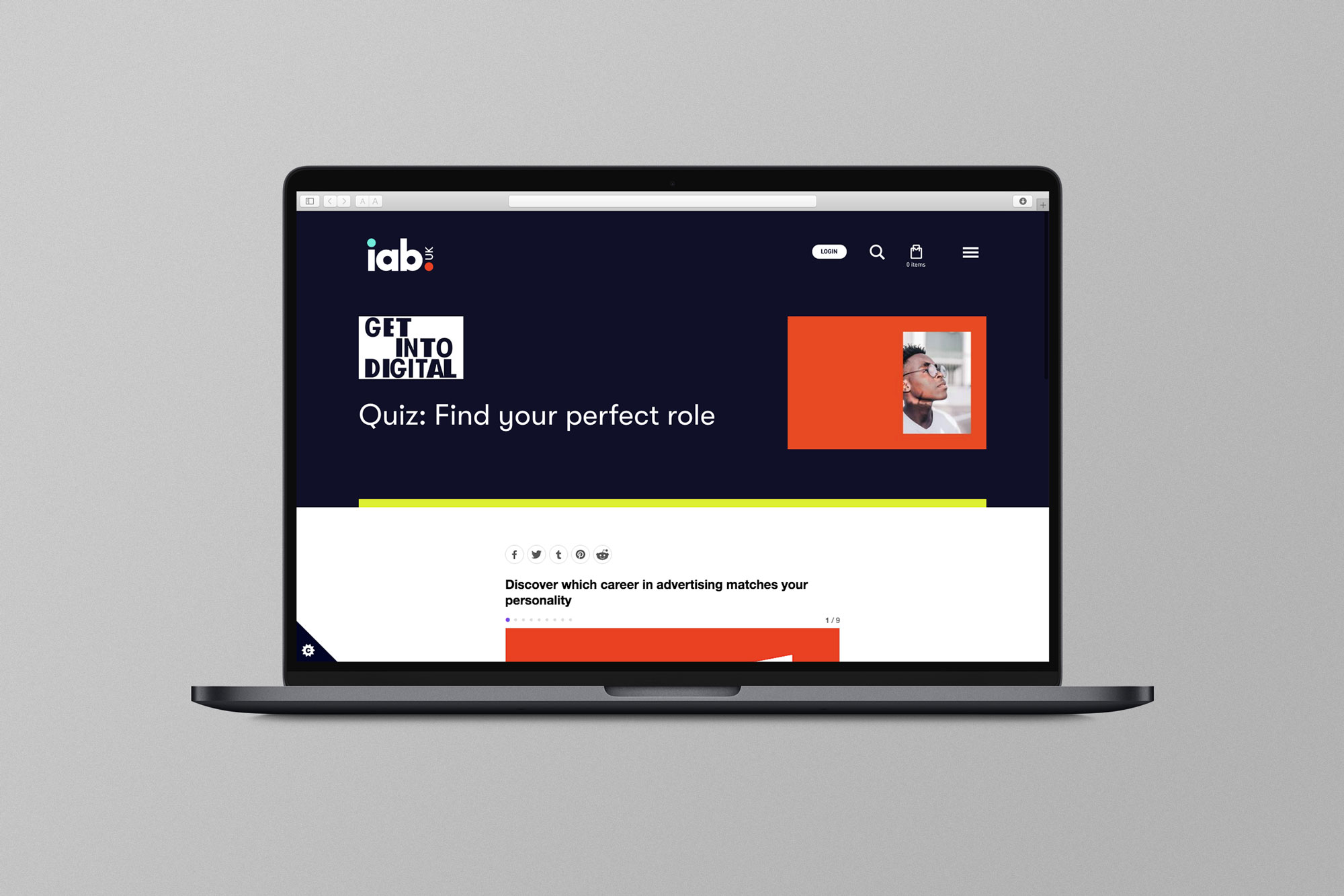
EX.CO & IAB
Interactive Article promoting roles into Digital to students

Valerio
Identity Design for an Independent Gardener

Donati Metalli
Logo/Identity Design for an Italian Metallurgical Company

EX.CO & Boots
Interactive Digital Article promoting Boots Vitamins for Kids

Undone Type
Alphabet Design
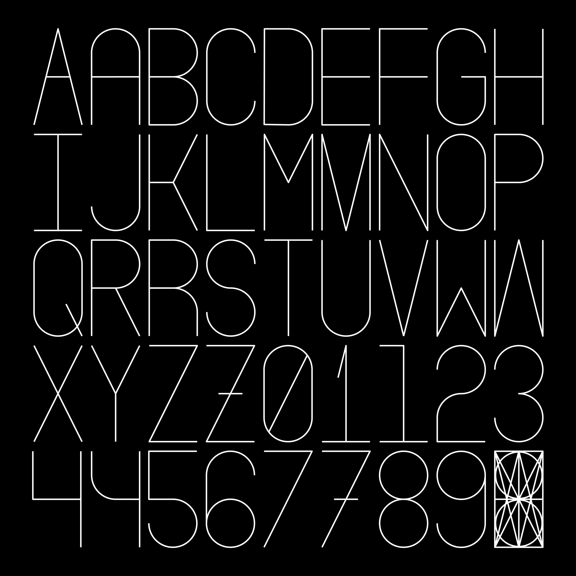
Houdini Alphabet
Alphabet Design